The Marketer’s Guide to Data Storytelling with DashThis

What if your data could tell a compelling narrative?
This is the art of data storytelling.
And you don't need to be an expert with business intelligence tools like Microsoft's Power BI or Tableau to turn complex data into actionable insights for data-driven decision-making.
Data storytelling lets you turn your raw data into a compelling story so your reader goes ‘aha!’. This guide explains what it is and how storytelling makes your data analysis easier to understand. You’ll also get a step-by-step process to put your data storytelling skills into practice with DashThis reports.
Table of contents
- What is data storytelling and why does it matter?
- A step-by-step guide: How to apply data storytelling to your marketing reports
- Turn scattered metrics into clear data stories with DashThis
What is data storytelling and why does it matter?
Effective data storytelling means explaining your numbers in a way that people can understand and directly apply to solve a problem they’re facing.
Rather than only reporting what happened, you use data analytics to explain why it happened and what you’ll do with that complex information for your client.
This applies both to individual metrics and structuring your report or dashboard to show how different metrics connect to explain an overarching point. Brian Weisberg, CFO of Tidelift, explains:
A good dashboard should answer the “why” and provide context for the broader story. For a simple analogy, imagine your favorite story. Metrics are the individual facts and observations. When strung together with a broader narrative, an engaging story begins to unfold. That is a dashboard. Your dashboard may give you unexpected (or expected) surprises, plot twists, and other valuable learnings that are much clearer alongside other data.”
Brian's point about stringing metrics together into a broader narrative becomes clearer when you see a real-world data storytelling example in action. Storytelling with Data shows how they rebuilt a dense dashboard as an infographic that leads with the key insights related to a reviewer’s key concerns.
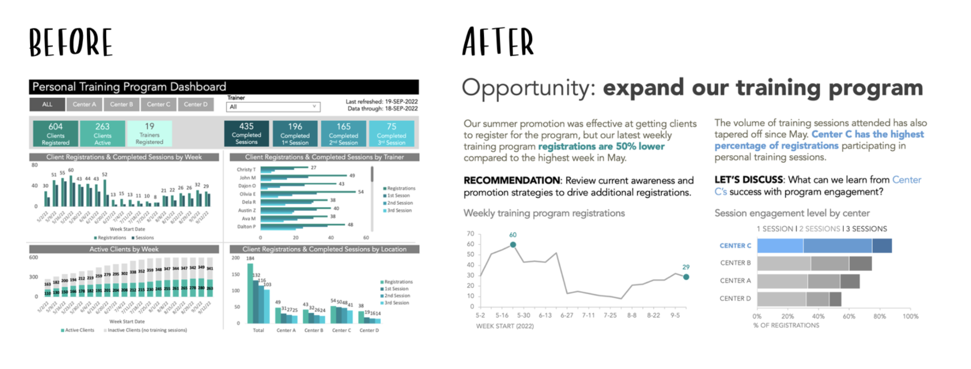
Image source: Storytelling with Data
This matters as the person reviewing your report is already drowning in data. The marketing dashboard you spent hours building is one of many they’ll scan that day. A 2025 TheyDo survey of US and European decision-makers found that executives felt overloaded by daily dashboards and worried the data may be misleading.
When data lacks context or a logical interpretation, it's easy to draw the wrong conclusions or miss what matters. But using data storytelling helps you avoid these fundamental issues and guide better decisions for your clients.
What is the difference between data visualization and data storytelling?
You'll often hear these terms used together, yet they play different roles in reporting. Data visualization turns data insights into visualizations, such as line charts or interactive widgets.
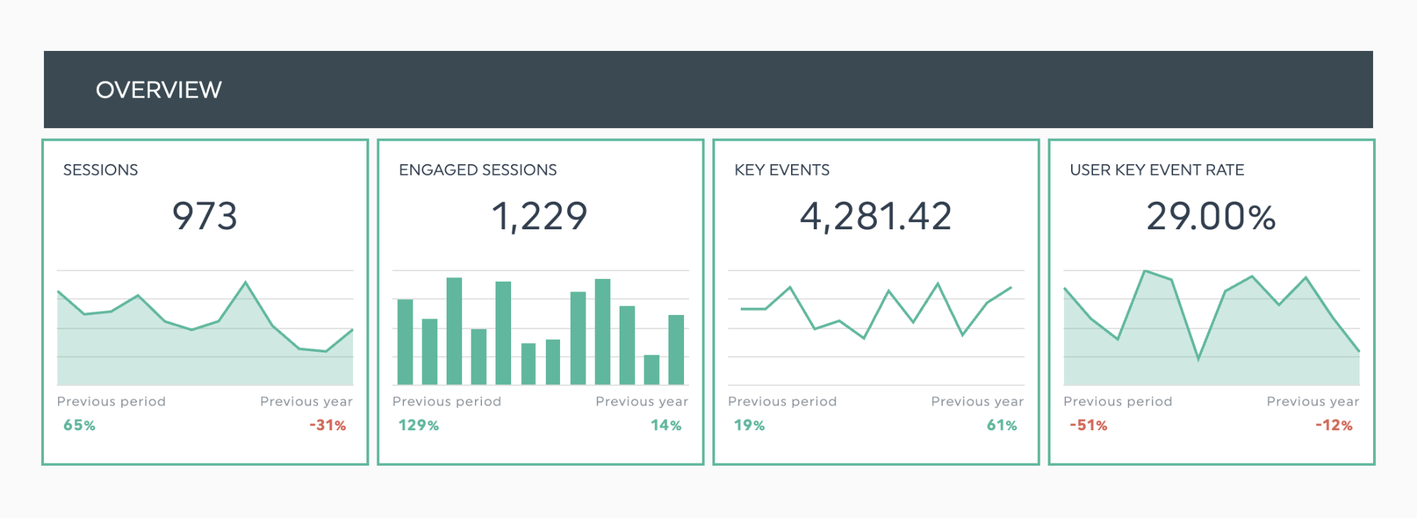
Image: Different chart types suit different metrics.
Data storytelling refers to the narrative you build from your data, pairing visuals with context and clear recommendations to guide decisions.
A step-by-step guide: How to apply data storytelling to your marketing reports
Ready to put data storytelling into practice? Follow these seven steps to build marketing reports with a clear story in place to guide your client’s decision-making.
Step 1: Understand your client’s business and define the goal of your report
A great report starts with being clear about why you’re creating it. Is it meant to show the value of your SEO work to support a contract renewal with a key client? Or is it to show that your marketing spend has been trending upward without a noticeable lift in performance, and to lay out the steps you’ll take to get back on track for your finance team?
The two reports serve different goals, so they need distinct structures and their own metrics. Let those goals define the context and the problem as the foundation of your data story, which anchors your analysis and the actions that follow in concrete numbers.
To do this effectively, you need to understand how your client’s business operates, your client’s needs, and the objectives of the people who will be reviewing your reports.
For agencies, this means translating your campaign planning and client onboarding process knowledge into a cohesive narrative. You already understand your client's lead generation strategies, qualification processes, and post-sale workflows from onboarding and campaign planning. Now you need to connect each metric in your report back to these processes.
Step 2: Create a rough storyboard for your report
Once you know what your report needs to do, turn that goal into a clear outline and a rough sketch of the visuals. You can explore your dashboard tool or use a template to get moving, but they’re just options among many ways to begin.
On the Storytelling with Data podcast, data scientist and educator Allison Horst suggests stepping away from the dashboard and storyboarding your report. Sketch the main points and visuals on paper first to clarify what you want to share and what your audience wants to see.
She says, “Storyboarding is a nice low-tech way of getting a sense of what your content might look like before you commit to your tools and start building things.”
You don’t need fancy tools to start storyboarding your report. Grab some post-it notes or rough paper and sketch out your ideas. Running your initial ideas by your team or client early on can save you hours later. This way, you’ll know what you’re trying to build before building your dashboard in your reporting tool.
Step 3: Select the right key performance indicators (KPIs)
Track metrics that show real progress, not vanity stats. Some numbers can sound impressive, yet they don’t reveal how you’re performing or guide your next moves. Use measures that link to concrete business outcomes and the priorities of the people who matter.
Unsure whether a metric is a vanity metric? Review the metrics you’re considering and ask yourself two questions.
- What are the people involved trying to accomplish?
- How will they know when they've succeeded?
These questions matter because the right KPIs differ by each client's industry, business model, and marketing priorities.
Even two clients using your SEO services will need different metrics based on their goals. A small auto shop aiming to boost local views and reviews will track very different metrics than a SaaS company tuning dozens of pages to be found by AI. The KPIs for each might be:
- Local auto business: Google Business Profile views, 'near me' search impressions, directions requests, and phone calls.
- SaaS enterprise: AI referral traffic from top content pages, conversions from AI referral traffic, citations in AI tools
Looking for a step-by-step way to choose the right KPIs for your report? Read our guide to selecting performance metrics for your marketing reports.
A common data storytelling mistake is cramming in too many metrics in a report or dashboard, which overwhelms readers. Focus on 3–5 KPIs that directly track progress toward your goal. Clients care about this, too. Jennifer Chin, Head Community Manager at Chime.io, puts it well in our reporting best practices roundup:
"Just because you have a number doesn't mean it needs to go into your report." Always remind yourself of the client's goal and make sure everything you include into your report is relevant. There's nothing worse than wading through a 10 page report when 1 or 2 pages would do. Jennifer Chin, Head Community Manager Chime.io
Step 4: Create a narrative arc for your data
A narrative arc means every data set has a clear:
- Beginning: Establishing the context or problem
- Middle: Showing your data analysis process and findings
- End: Extracting the key takeaways, then suggest a clear next step tied to the data.
As a data analyst, you present data to help clients with their decision-making. That hasn't changed. Your job is still to shape the information into clear takeaways that help decision makers quickly spot what matters to them.
How to apply a narrative arc to your data
You can use this approach for a single metric or to connect multiple data points into a larger story.
Explaining one key metric
Here’s how to report a conversion lift from a successful email marketing campaign.
| Raw data | Raw data with data storytelling |
|---|---|
| Conversions increased 50% in October compared to September. | Establish context & problem After conversion rates stalled in Q2, we rolled out personalized email sequences for our most engaged users in October. Findings & analysis The initiative had a positive result, with conversions increasing by 50%. That's 150 new customers in the last 30 days. What drove this success? Users who received tailored product recommendations converted at 3x the rate of those who received our standard messaging. This puts us back on track to hit our Q4 target of 500 new customers. Key takeaway and practical next step We should extend this personalization approach to other audience segments next month. |
Explaining multiple data points
You can connect multiple data points to tell a bigger story. Suppose your client wants to improve paid social media acquisition in Q4 but isn't sure which channel should get more budget. Show how the metrics move together and what that implies for spend. For example:
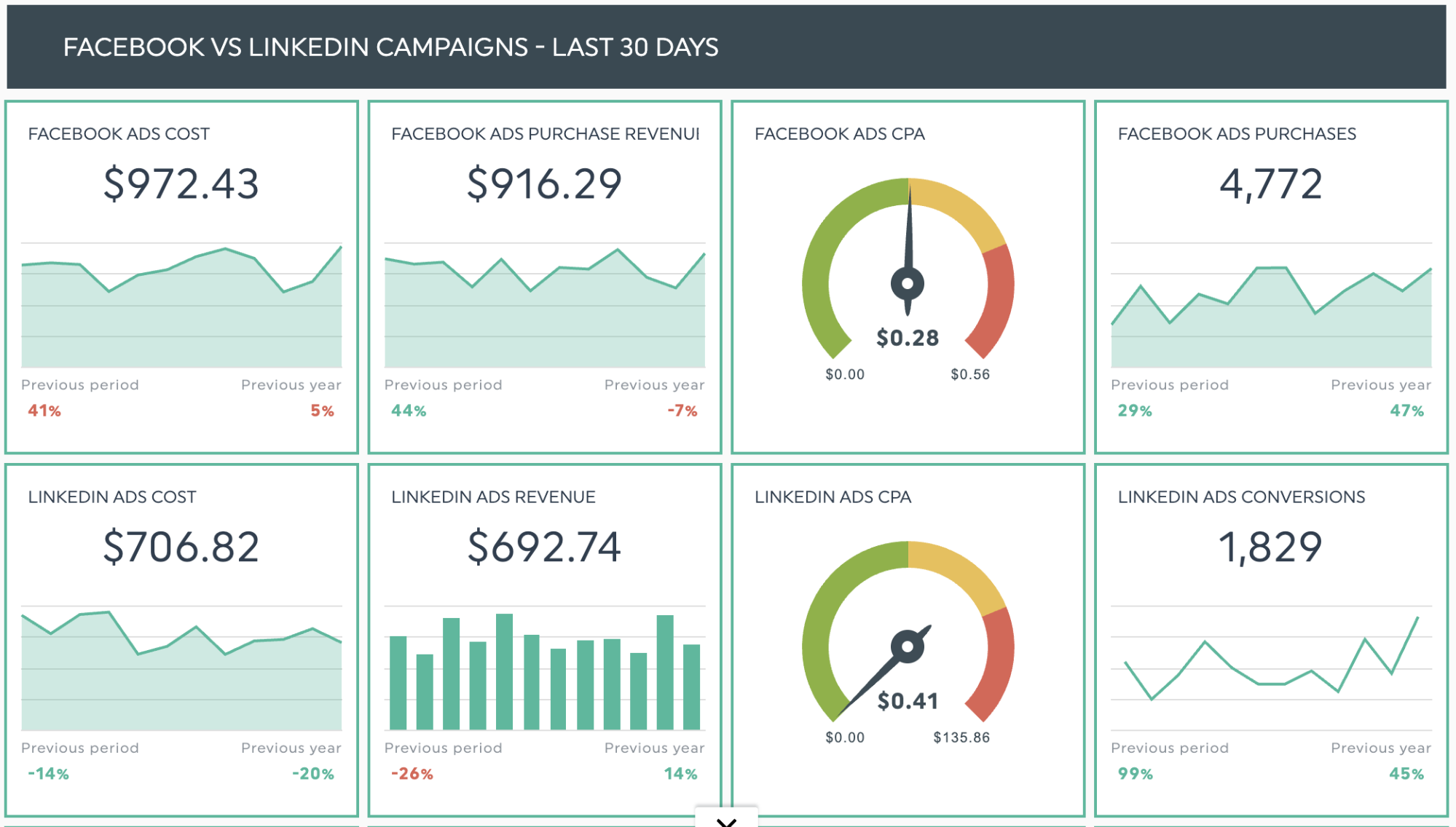
Get this digital advertising report template with your own data!
Context: In Q3, you split the budget evenly between LinkedIn and Facebook Ads. Now is a good time to shift more spend to the channel that delivers the most conversions.
Analysis: LinkedIn Ads outperformed Facebook, generating more conversions at a 42% lower cost per acquisition.
Insight + Recommendation: Move most of your Q4 budget to LinkedIn Ads to cut acquisition costs by about 30% without losing conversions.
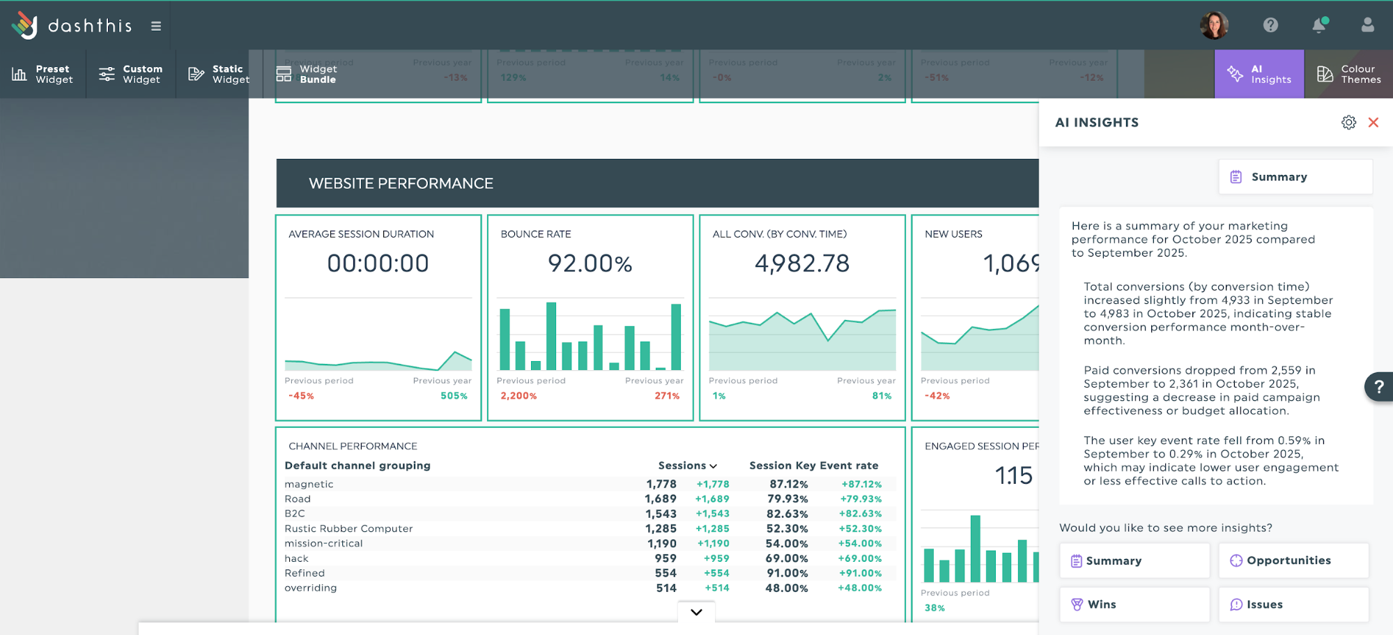
To build these analyses, you can connect the dots yourself or review different metrics to clarify your findings. You don’t have to do it alone, though. DashThis’s AI reporting tool can jumpstart your analysis by calling out key changes in the data and surfacing opportunities or issues to investigate.
The same principle applies whether you're building an interactive dashboard or a narrative report; both require context to convey the full story of your data.
Step 5: Use dashboards and visual elements to guide the audience’s attention.
Telling a story with data is about drawing attention to what matters most. When clients can spot the key points quickly and see how they connect to their business and job, they're more likely to take your reports seriously.
Visual elements such as bar charts and line graphs help guide your reader’s attention. These cues include subtle features, such as colour coding, that draw attention to the key elements of your data story.
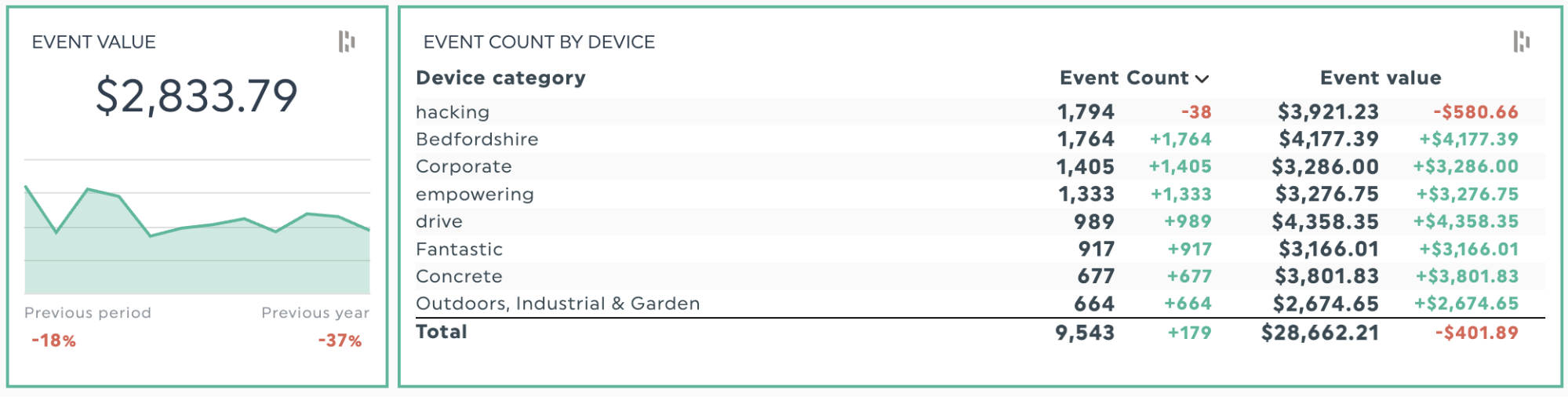
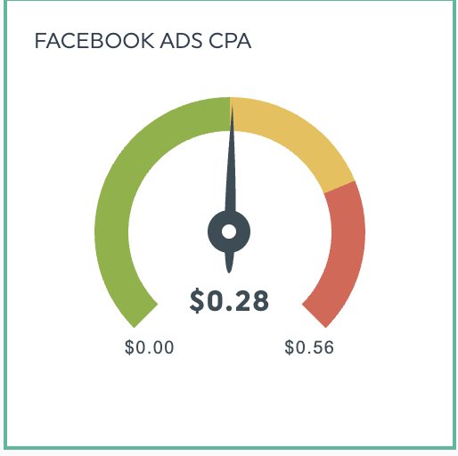
Let's say you need to explain changes in ROI across different device categories. A simple table with color coding can quickly show which devices are performing well and which aren't, making the point clear at a glance.
Without the right tool, building custom visualizations for each client is slow and inconsistent. Sheffield-based digital agency Evoluted turned to DashThis to streamline its dashboard creation and client reporting.
“DashThis’ biggest plus is that dashboards can be completely tailored to each client’s needs. That means building it around the specific metrics they care about, but also with the flexibility to evolve over time as our relationship develops and new goals are agreed.”
That tailoring extends to how data is presented - using pre-set widgets or custom-made ones, our team can drag-and-drop features to easily display data as graphs, charts or raw numbers, and seamlessly segment different traffic sources.
Need a more in-depth explanation on how to use visuals in your reporting? Learn more about effective data visualization techniques in our guide.
Step 6: Add context and insights:
Context and insights help explain why results happened, not just what happened.
These data comparisons can look like:
Trends over time: Is a metric going up or down over time?
Previous time period: How did this week's performance compare to last week?
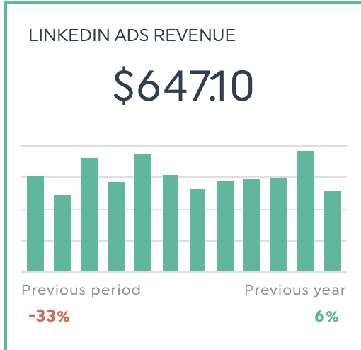
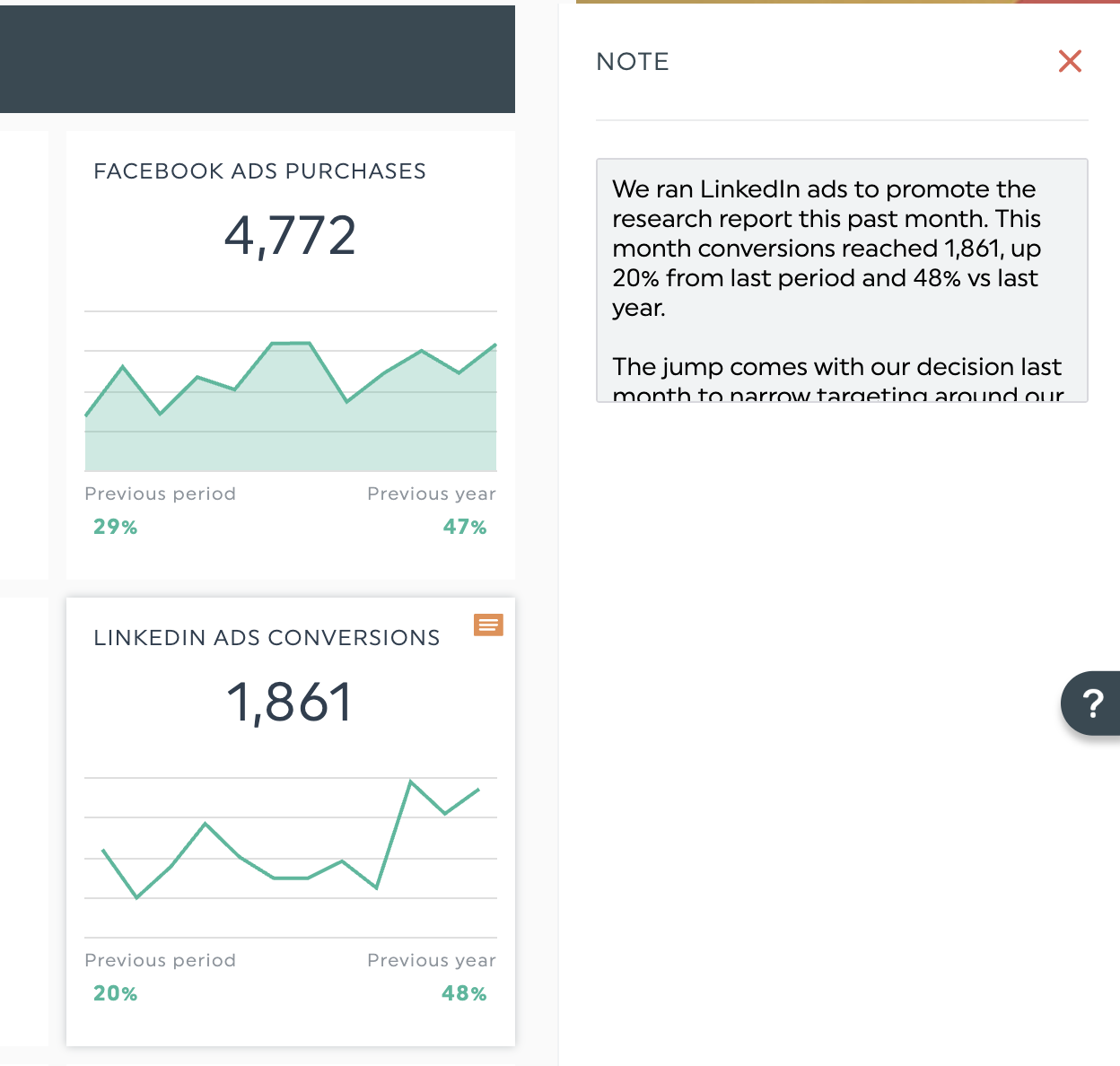
Same time period, previous year: How did our LinkedIn ads revenue compare?
Target goal: Is performance meeting, exceeding, or falling short of our benchmark?
Adding explanations can clutter a report. DashThis’s notes and comments let you add context to specific metrics or sections of a report without introducing visual noise. For example, you can explain a jump in conversions in a comment like this.
You can use notes and comments to define your metrics, helping everyone understand what each one means and how it’s calculated.
When you're dealing with ROI or financial metrics, clarity matters even more. As Brian Weisberg advises, "Make sure everyone is aligned and clear on metrics definitions, like funnel metrics, sales stages, and annual recurring revenue." That way, your client reads the data the same way you do.
Step 7: Deliver your data story
You’ve done the hard work. Now deliver it to your client with a polished handoff. DashThis offers several ways to share your report: send by email, paste a live dashboard link in Slack, or save a PDF to your shared drive.
Your client experience doesn’t have to end when you hit send. Take the marketing agency Search Station. Their team pairs DashThis reports with screen-recorded walkthroughs to discuss and explain results to clients. Doing so shows they value clear communication and strong relationships, both of which are essential to any agency.
Bonus step: Follow up after you send your report
One final tip from our friends at Evoluted: remember to follow up with your clients after you send your report.
Don’t be tempted to simply send your reports and then forget about them. Encourage feedback from your clients and offer to talk them through any of the results or work they don’t understand. Why not give them a call if you don’t hear back, too?
This way, you can help them to get the most value from the reports while ensuring they also understand the value of the work you’ve done for them. This will go a long way toward reinforcing your relationship with them.
The same principle applies to any marketing dashboard you share with clients: their business and priorities will change, so your data story should change with them.
For example, you could schedule quarterly check-ins where you ask:
- Is the narrative still relevant? Do these metrics still match what they are trying to achieve now?
- Are we surfacing the right insights? What questions do your client and the people who rely on the dashboard still have that it doesn't answer?
- Is the dashboard easy to follow? Where do they get stuck or confused?
Turn scattered metrics into clear data stories with DashThis
Data storytelling turns your marketing metrics into a simple story that helps clients understand and act on what you present. It’s a core skill that helps you communicate your campaign’s effectiveness and show the value of your work and your agency.
Start with your audience’s goals, not your metrics. Use visuals that highlight what matters, and structure each metric to show why it matters and link it to clear next steps.
DashThis removes the tedious parts of reporting. Connect your data sources, then use our built-in AI insights to surface what matters and share reports that are easy to act on, without hours of manual work. Bonus: dashboards update automatically, so you can spend time on strategy, not spreadsheets.
Ready to stop reporting numbers and start telling stories? Try DashThis free for 14 days.

Discover AI-driven Insights with DashThis
Read More

Don’t miss out!
Follow us on social media to stay tuned!
Automate your reports!
Bring all your marketing data into one automated report.
Try dashthis for free