How to visualize data: examples, tips & best practices

Data visualization website Information is Beautiful turns complex data sets into beautiful, simple diagrams, covering topics as diverse as data breaches to Wikipedia edit wars.
They now see over 300,000 monthly visits and have hundreds of interesting infographics on their site.
Data visualization makes data exciting and accessible to people unfamiliar with the topic through intuitive visuals. This also applies to business communication.
How do you visualize business data? We walk through a step-by-step process here.
- What is data visualization?
- Why data visualization works: Making sense of vast quantities of data
- How to visualize data: A step-by-step tutorial
- - Know the message you’re trying to communicate
- - Tailor your report to who you’re communicating to
- - Keep it clear & concise
- Data visualization examples: How to turn data into actionable insights
- Data visualization made simple with DashThis.
What is data visualization?
It’s making data easier to understand with graphical representations like charts, graphs, and widgets.
How can different visualization types be used in business intelligence or data analysis?
Teaching tool. Data gets distilled into accessible graphics and diagrams, benefitting people unfamiliar with the topic. Example: Explaining top-performing marketing channels to other teams using a bar graph or histogram.
Reporting and decision making. Campaign managers rely on visualizations to understand their campaign’s performance and simplify decision-making for executives.
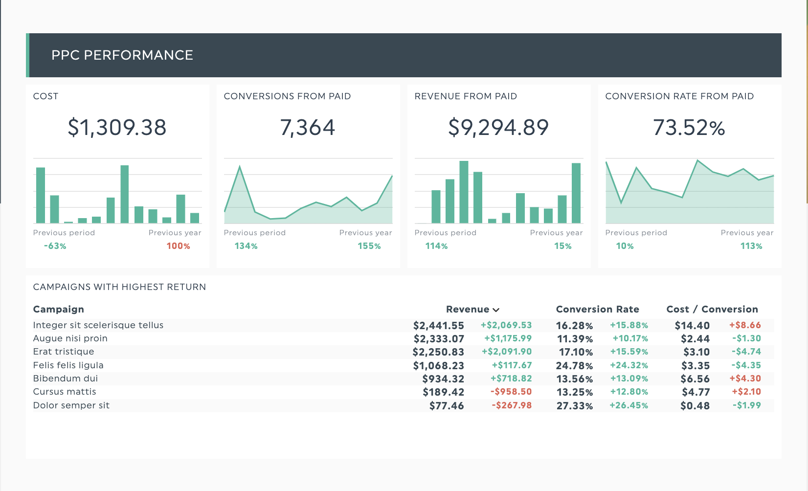
PPC campaign performance visualized in DashThis. Get this visualization with your own data!
Why data visualization works: Making sense of vast quantities of data
90% of the information your brain receives is visual, and we process data presented with the right visualization approximately 60,000 times faster and more efficiently than text or verbal communication.
But how compelling are visualizations?
A simple example would be this interactive visualization of languages in the world.

Source: After Babylon
Looking at this infographic, you’ll learn:
- The top 10 most spoken languages
- The number of people who speak each language
So far, so good.
Now, what if we used a table to present data?

Source: Wikipedia
Wikipedia’s table does the job, but would you look at a plain table or a beautiful map instead?
Unless you live in Excel pivot tables, you’re more likely to prefer looking at a visual.
Now imagine this with marketing data.
Visualizations help your non-marketing CEO immediately understand your latest web performance data. A good data visualization makes it easier to communicate your results to them, identify relationships between variables, and secure buy-in and confidence in your efforts, saving you time and effort on lengthy explanations.
Fewer questions, more budgets, stakeholder confidence, and time saved? Sounds like a win for both your team and your CEO.
Data visualizations are a tool to help you get there.
How to visualize data: A step-by-step tutorial
Use this step-by-step guide to make sure you use data visualization effectively.
1. Know the message you’re trying to communicate
Before you mess about in your data visualization tool, start knowing what you want your visualization to say.
Think of these questions to start:
- What is the aim of my data visualization? Am I making a case for an initiative, informing other teams about what I do, or exploring something in more detail?
- What trends am I studying? Am I comparing different values or analyzing a single trend in time?
- How does my visualization support my message? For example, column charts are best suited to compare 2 items over a period of time.
2. Tailor your report to who you’re communicating to
Questions to think about.
- What are they looking for in this report?
- What are their concerns, and how can you address them?
Once you know this, you can tailor the chart types and your x-axis and y-axis labels to best communicate your message.
For example, CMOs care about meeting lead generation targets within a period of time while staying within the allocated marketing budget.
So, in your monthly digital marketing report, communicate the following:
- Total number of leads generated this month, broken down by source and landing page
- Conversion rates across marketing channels, highlighting any outliers
- How much you’ve spent proportional to the revenue attributed to marketing leads
3. Keep it clear & concise
Clarity:
Use section headers to guide the reader. DashThis’s report templates employ titles to act as visual separators.
In your text header, you could either break charts up by type of data or use the text headers to emphasize critical points (for example, conversion rates from organic traffic hold steady at 16%)
Conciseness:
Keep data points relevant to your presentation. If you were reporting on overall sales numbers and pipeline health, keep your data relevant to sales metrics with no more than 5 charts in one dashboard.
What if you have too many KPIs to fit in one report?
You could break up a report into different dashboards to keep them easy to categorize. For example, a comprehensive marketing report might include an executive summary and individual reports diving into specific channels, like email marketing, digital marketing, and social media performance.
Read more:
Context: The key to valuable data
Context helps people interpret data to decide.
Context makes numbers useful. It allows people to interpret data and make decisions.
Let’s say you’re presenting to a marketing director who wants to know the number of leads generated this month.
Meh answer: We generated 80 leads in October. (Question: Is this a good or bad result?)
Better answer: We generated 80 leads in October, a 25% increase from last month, thanks to several campaign tweaks.
How to add valuable context for your data visualization:
- Show progress towards a goal (either % or numerical value works fine) e.g We are 80% of our lead generation target
- Visualize change in a KPI compared to your previous report - e.g. 80 leads is 20% more than last month's number.
- Establish correlations between 2 variables: Is there a correlation between on-page keyword usage and rankings in SEO reporting?
You can add notes on what worked/didn't work this month.
Aggregate data from multiple data sources
Marketers are no strangers to using multiple tools, from SEO tools, email marketing tools, and apps to manage your PPC campaigns.
Data visualization tools like DashThis combine data from all these data sources and aggregate it into one dashboard for quicker decision-making. You’ll want your make sure your data is accurate, appropriate, and clean to make comparisons and analysis easy.
Include different types of data visualization to drive home your points
For example, gauge charts work well when showing progress towards goals or establishing benchmarks. Set your own boundary values to define the widget's red, yellow and green areas.
Here’s how it’s done in DashThis.

Line graphs, line charts, or area charts work well when you want to show KPI (or two) trends over time to track campaign performance or strategic planning.
Use a pie or doughnut chart to break down or segment a data set. Here’s a pie chart breaking down top search engines by browser type for more accessible data analysis.

Data visualization examples: How to turn data into actionable insights
We’ve got 4 done-for-you data visualization templates to turn your marketing reports from blah to boom.
Digital marketing report template

Get this digital marketing data visualization with your own data
Make your CMO’s life easier by presenting this easy-to-read digital marketing report combining insights from all your marketing campaigns and tools in one beautifully formatted report.
Tip: Use section headers to direct your reader’s eye to important information or break up metrics by marketing channel.
Executive report template

Get this executive report data visualization with your own data
Senior executives are busy people, so get to the point quickly when presenting data.
This scannable report keeps highlights at the top, ensuring your executive can glance at the report while maintaining details available in different sections for further analysis.
Advertising campaign report template
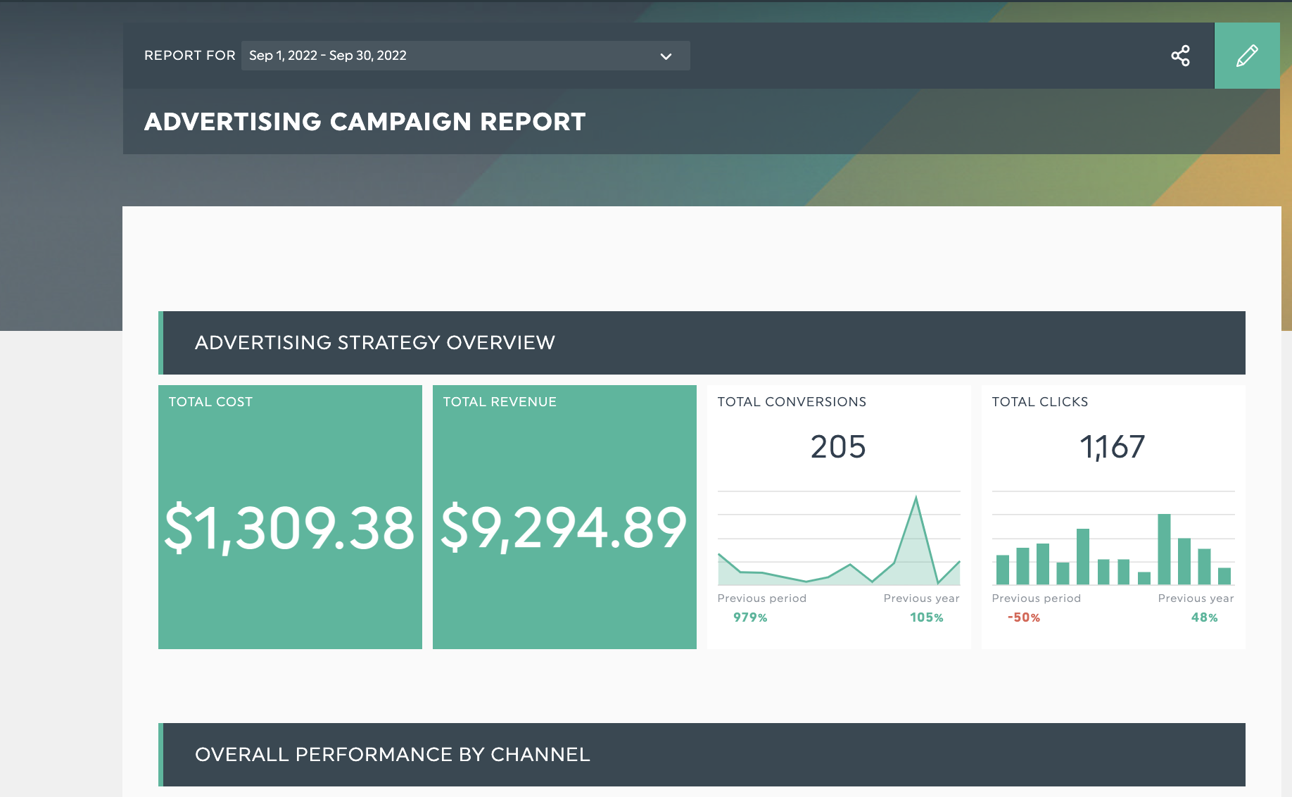
Get this advertising campaign data visualization with your own data
Running a multi-channel advertising campaign? With this report, you have all your advertising data at your fingertips, helping you build trust with your clients or stakeholders on what’s happening in your campaigns.
Email report template

Get this email report data visualization with your own data
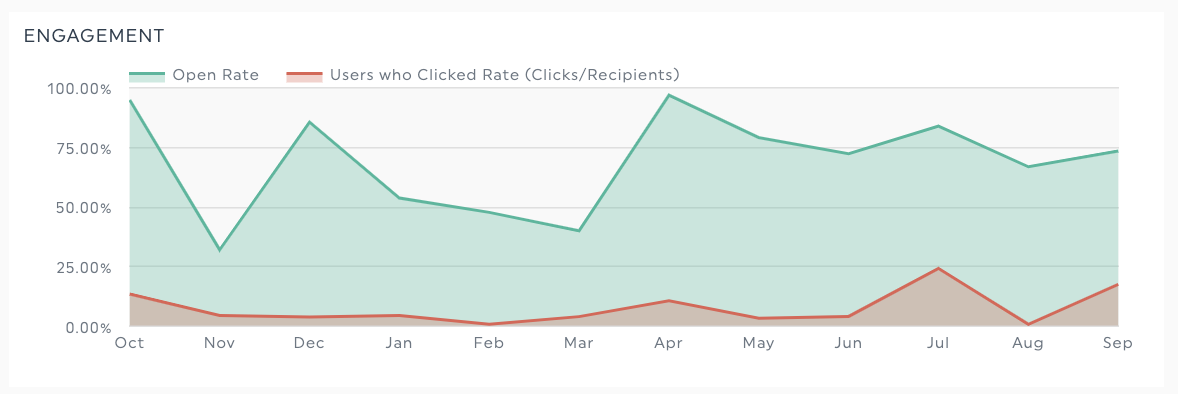
Track all your email marketing KPIs like open rates, unsubscribes, and clickthroughs. Subscriber growth, top subject lines, and content that works in one report.
Visualize your marketing data with a beautiful DashThis report

Get 20+ dashboard templates just like this one with DashThis. Try it with your data here.
You can get started in minutes. All you need to do is.
- Sign up for an account with our free 15-day trial
- Connect your marketing tools with our 40+ integrations
- Select the metrics to include from our Preset Widgets
- Choose your preferred preset marketing report template or create a new one from scratch!
Data visualization made simple with DashThis.
You don’t need to be a seasoned data analyst, understand big data, or have data science qualifications to create your own data visualization.
Support your marketing reports with clear data visualizations. Clear reports mean more assertive communication, which builds trust and rapport with your clients and stakeholders.
Now you can easily communicate campaign progress, help your executives with guided decision making and get a clearer understanding of where your campaigns are performing, and opportunities to improve.

Ready to visualize your data with Dashthis?
Read More

Don’t miss out!
Follow us on social media to stay tuned!
Automate your reports!
Bring all your marketing data into one automated report.
Try dashthis for free