7 Data Visualization Dashboard Example to WOW Clients

If it weren’t for data visualizations, we wouldn’t be able to untangle complex data and distill them into an actionable plan.
In this post, let’s look at seven different data visualization dashboard examples, why they matter to marketers and clients, and how you can create them without breaking a sweat.
- What is a Data Visualization Dashboard?
- Data Visualization Dashboard Examples
- - Digital Marketing Dashboard Example
- - Google Analytics Dashboard Example
- - Social Media Dashboard Example
- - Executive Dashboard Example
- - Ecommerce Dashboard Example
- - Email & Marketing Automation Dashboard Example
- - SEO Dashboard Example
- How to Create a Data Visualization Dashboard
- Say Goodbye to Messy Data Analytics
What is a Data Visualization Dashboard?
A data visualization dashboard tracks key performance indicators (KPIs) across multiple marketing channels and transforms them into a visually beautiful report.
It’s like an infographic that helps you make sense of your complex data.
Data visualizations that take seconds to grasp > Mind-numbing data that only a data science expert can crack
Both marketers and clients can benefit from using a data visualization dashboard tool.
These self-service interactive dashboards boast pre-made templates with pre-loaded marketing metrics (how meta!), saving marketers time from grabbing data from one channel to another.
Busy clients can also perform data analysis in a bird's-eye view and make fast business decisions. Thanks to the accessible bar and pie charts, it’s easy to see what’s working (or not) and reshape the strategies accordingly.
Data Visualization Dashboard Examples
Digital Marketing Dashboard Example
Digital marketing is a mountain of a topic. Social media, email marketing, public relations, you name it.
An effective digital marketing dashboard will effortlessly break down these varied results in a digestible and straightforward context.
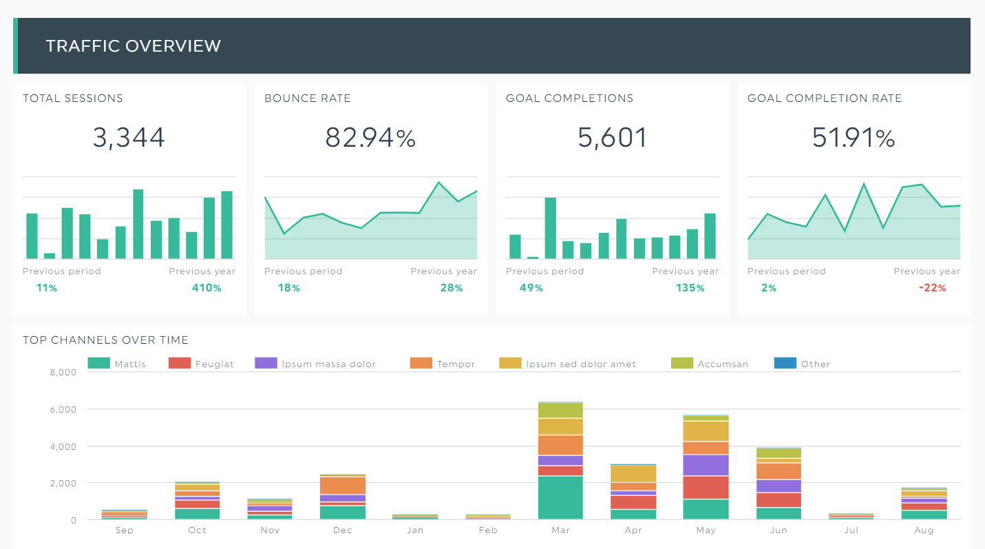
Combining two main channels, SEO and PPC, this single dashboard below gives us an overview of the total website traffic and how organic and paid traffic contribute to its success.
Wondering how many users completed an action in March? Simply mouse over to the month in the goal completion bar charts.

Hover the data points in these interactive visualizations to see how your website performs in a specific time.
Grab this digital marketing dashboard with your own data!
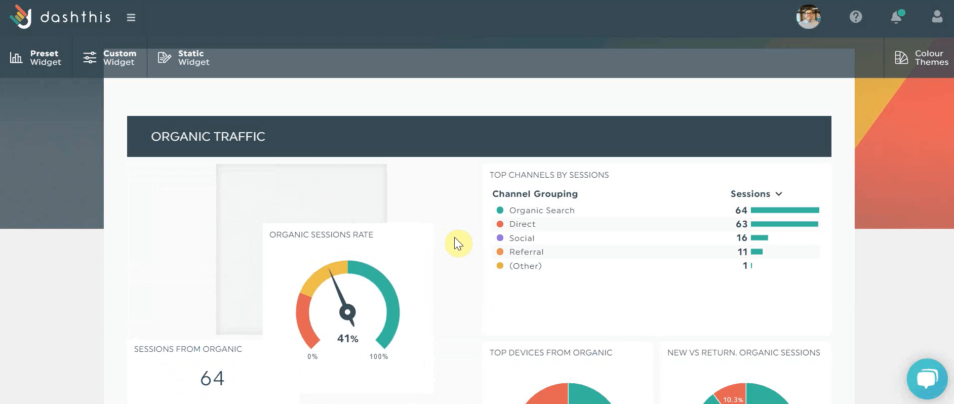
Google Analytics Dashboard Example
Google Analytics (GA) is a behemoth of raw data. The real-time report alone can single-handedly send us down into a spiral of confusion...
Seasoned users or not, it can take a long time to navigate the multiple metrics and dimensions. Fortunately, a data visualization dashboard software can help distill this complex information into an action plan.
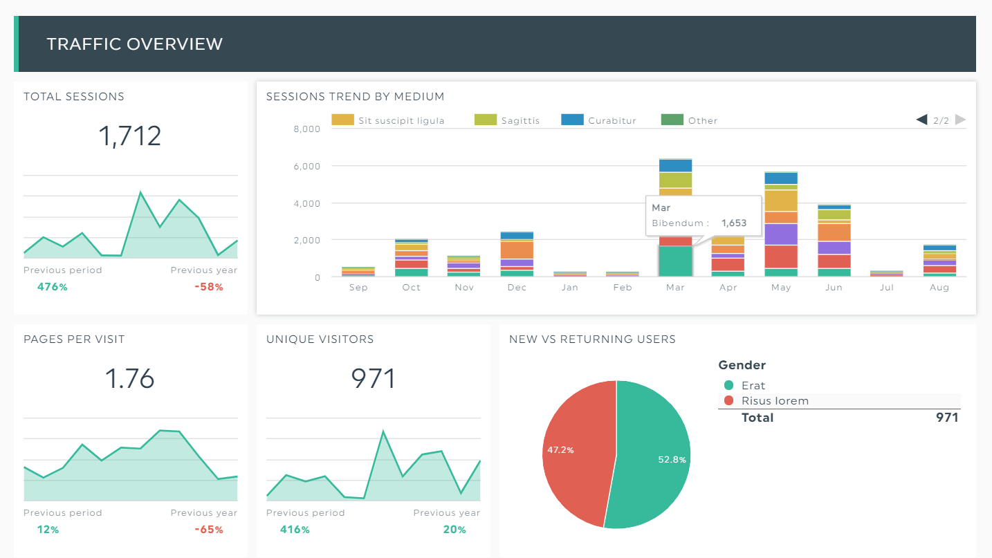
And yes, you can even drill down into the specifics, such as the sessions trend by source or medium!
Grab this Google Analytics KPI dashboard with your own data!
Social Media Dashboard Example
Social media is a hard nut to crack, no thanks to the constant algorithm changes. Nonetheless, these platforms can be well worth the time.
But you already know that, don't you? What you need is a quick-to-grasp report that proudly displays your hard-won social media efforts.
This social media dashboard, visualizing some of the must-have social media KPIs in a hybrid strategy, helps you identify your best channels and how organic reach stacks up against paid advertising.

Grab this social media dashboard with your own data!
Executive Dashboard Example
C-suites don’t need to know the itty-bitty details. That one LinkedIn post that brought in the third-highest number of sales? Go ahead and skip it.
These executives want “big picture” data sets that drive meaningful ROI (think cost per transaction and revenue by source).
Here’s a business dashboard that gathers such business intelligence.

Grab this business executive dashboard with your own data!
Ecommerce Dashboard Example
Ecommerce focuses primarily on the bottom of the funnel.
This means we’re talking about sales-driven ecommerce metrics like product check-outs and total store sales.
Which remarketing ads attracted the highest number of sales? Which seasonal email discounts performed the best? An ecommerce dashboard answers all these questions.
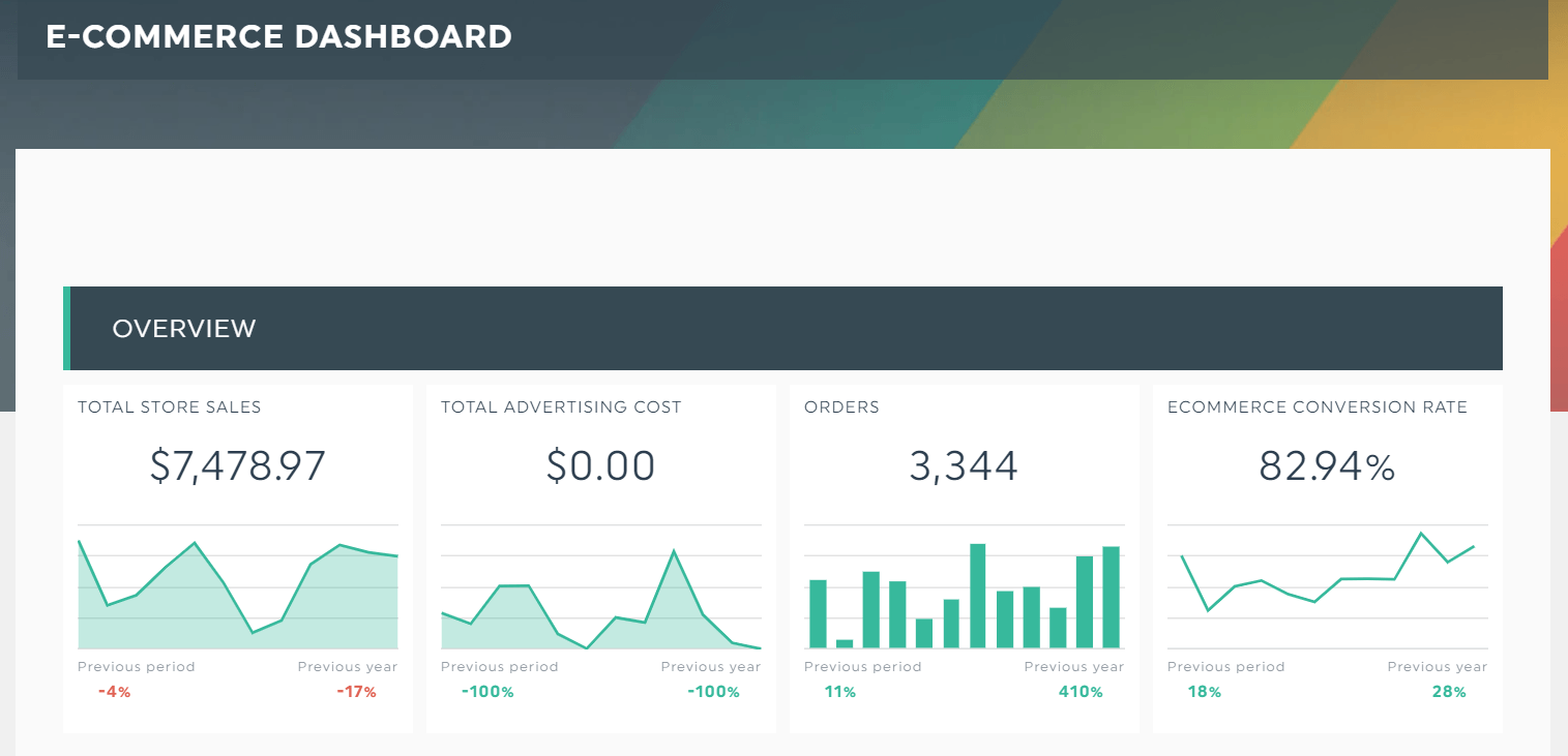
Grab this ecommerce dashboard with
Email & Marketing Automation Dashboard Example
Are you working with a client with low open rates and double-digit spam reports?
Hold it right there. You might want to analyze their data before creating a re-engagement email strategy.
An email analytics dashboard is the perfect solution. With email marketing metrics displayed like this, no marketer or client will be left in a befuddled state.

Grab this email analytics dashboard with your own data!
SEO Dashboard Example
SEO is one of the best long-term distribution channels.
Is your client still struggling to understand how it impacts their conversions after analyzing your Excel spreadsheet?
Opt for an SEO and backlinks dashboard to convince them to scale their content efforts. An eye-catching report peppered with SEO KPIs might just do the trick.

Back up your SEO strategies with proven results. Show how backlinks impact your rankings and conversions with these simple graphics.
Grab this SEO dashboard with your own data!
How to Create a Data Visualization Dashboard
Now that you’ve made it this far, you might be wondering:
“That’s fine and dandy, DashThis. Now show us how to create a data visualization dashboard!”
You’re eager to learn. We respect that.
To get started:
- Connect your data sources with DashThis
- Choose a dashboard (Tip: To start with a clean slate, opt for a blank dashboard. Want to save valuable time? Choose from 40+ pre-made templates)
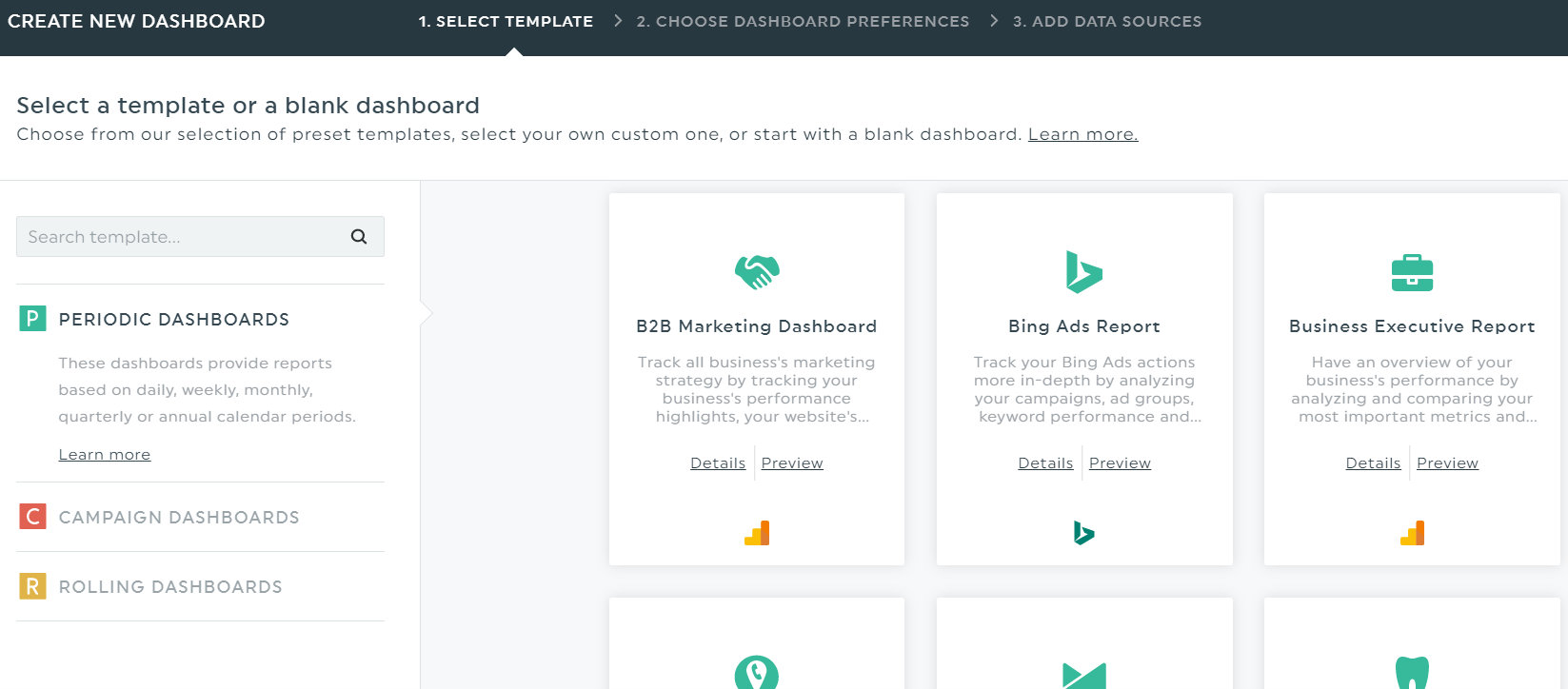
Both the blank dashboards and templates include preset widgets, and the templates even have pre-loaded KPIs.
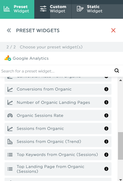
Click Preset Widget to select the KPIs you’re looking for, and DashThis will automatically grab the data accordingly.
There are multiple ways to customize your data visualization dashboards.
To change the colour, click Colour Themes. For a personalized and branded touch, add your client’s logo on the top left corner.
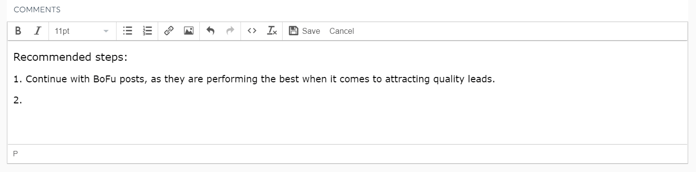
Pro Tip: Click Static Widget > Comments to share your insights. This lets you educate clients on the next step in their marketing strategy, saving you the hassle of emailing each other back and forth or *gasp* getting on another video call.
You can even drag and drop the KPIs around if you’re not 100% satisfied with the way your dashboard looks.
DashThis offers many customization options. To change the position of a KPI, click and hold the hover icon (not shown on picture) and move it around.
A data visualization dashboard design that’s beautiful and easy to grasp? That’s bound to take your client’s breath away.
Say Goodbye to Messy Data Analytics
Not everyone's a data scientist.
Luckily, data visualization tools can unravel these complex numbers and help us spot trends and patterns.
Besides conveying information within seconds, these accessible dashboards also speed up decision-making by a mile.
If you want to:
- Save time from grabbing data from one channel to another,
- Help busy clients make sense of their marketing efforts, and
- Create a spectacular all-round experience for all project stakeholders
Then look no further.
Start your free 15-day trial with DashThis today.

Read More

Don’t miss out!
Follow us on social media to stay tuned!
Automate your reports!
Bring all your marketing data into one automated report.
Try dashthis for free