A Beginner’s Guide to Marketing Data Visualization (How-to, Expert Tips and Examples)

Introducing visual elements into your marketing reports can make them more persuasive and help your clients make informed decisions about their marketing. Better still, you don’t need complex data analytics tools like Power BI or Tableau or deal with big data to create engaging dashboards for your clients or stakeholders.
This guide will show you how to use data visualizations in your marketing reports and how they can help you improve your reporting.
- What is marketing data visualization?
- Benefits and use cases of marketing data visualization
- 7 marketing data visualizations to use in your reports
- How to visualize your marketing data with DashThis
- Tips to make engaging marketing data visualizations
- Level up your marketing reports with DashThis’s data visualization tools
What is marketing data visualization?
Marketing data visualization is the art of turning complex data and large data sets into visuals like bar graphs, pie charts, scatter plots or heatmaps.
Visualizations make dull marketing data come alive and make your reports more digestible for busy clients and executives. Consider the difference between presenting data in a spreadsheet and a dashboard using data visualization tools.
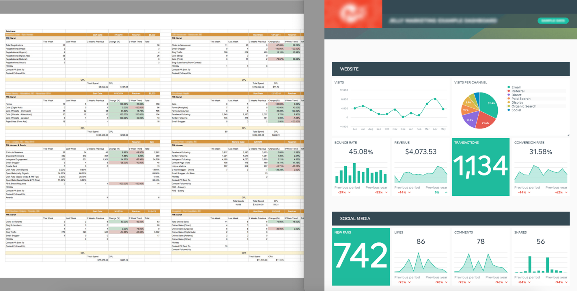
DashThis customer Jelly Marketing revamps their marketing reporting from plain tables to an interactive dashboard
Some examples of marketing metrics you can visualize
- Website analytics
- Search engine optimization (SEO) keyword rankings
- Multi-channel digital marketing campaigns
- Social media reporting
Visualizations make large amounts of data clear and concise. For example, it’s easier to see trends and patterns over time, compare performance metrics across different marketing channels or get an overview of your marketing and sales metrics to make strategic decisions.
Benefits and use cases of marketing data visualization
Make your reports easier to understand
It's easier to understand charts and graphs than rows of statistics or walls of text.
![]()
Eye-tracking studies show that people are less likely to read blocks of text without section breaks, illustrations, or visual hierarchy.
Without visual aids to guide the reader, people scan randomly, are less interested in reading every word, and are less sure where to focus. Visual elements guide your clients or stakeholders through your report and tell them where to focus their attention.
Speed up decision-making
Visualizations help you communicate complex data or compare data across multiple sources without interrupting a discussion.
Let’s say you’re analyzing your marketing acquisition efforts and discussing PPC, SEO, direct traffic, and email marketing campaign strategy. With siloed data, it’s difficult to see the complete picture.
By integrating multiple data sources into one dashboard and using bar chart visualizations, you can see your clients' KPIs and performance metrics across channels in one place, making it easier to identify trends and improvement opportunities.
Enhanced communication among team members and clients
Interactive dashboards make it easier for everyone to analyze real-time data and evaluate marketing efforts together. You can hover over visual elements for more information or compare different periods in a report without toggling tabs or interrupting your flow.
It’s perfect for remote client discussions or updating your marketing team with the latest metrics.
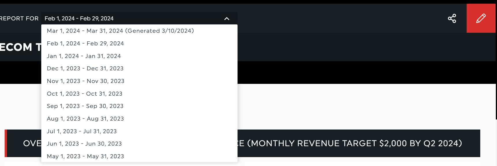
A dropdown menu with different reporting time period options
7 marketing data visualizations to use in your reports
We’ve outlined several types of charts and widgets you can use for data analysis and help your client make data-driven decisions. Need more guidance on how to use these visualizations in your DashThis reports? Check out this guide.
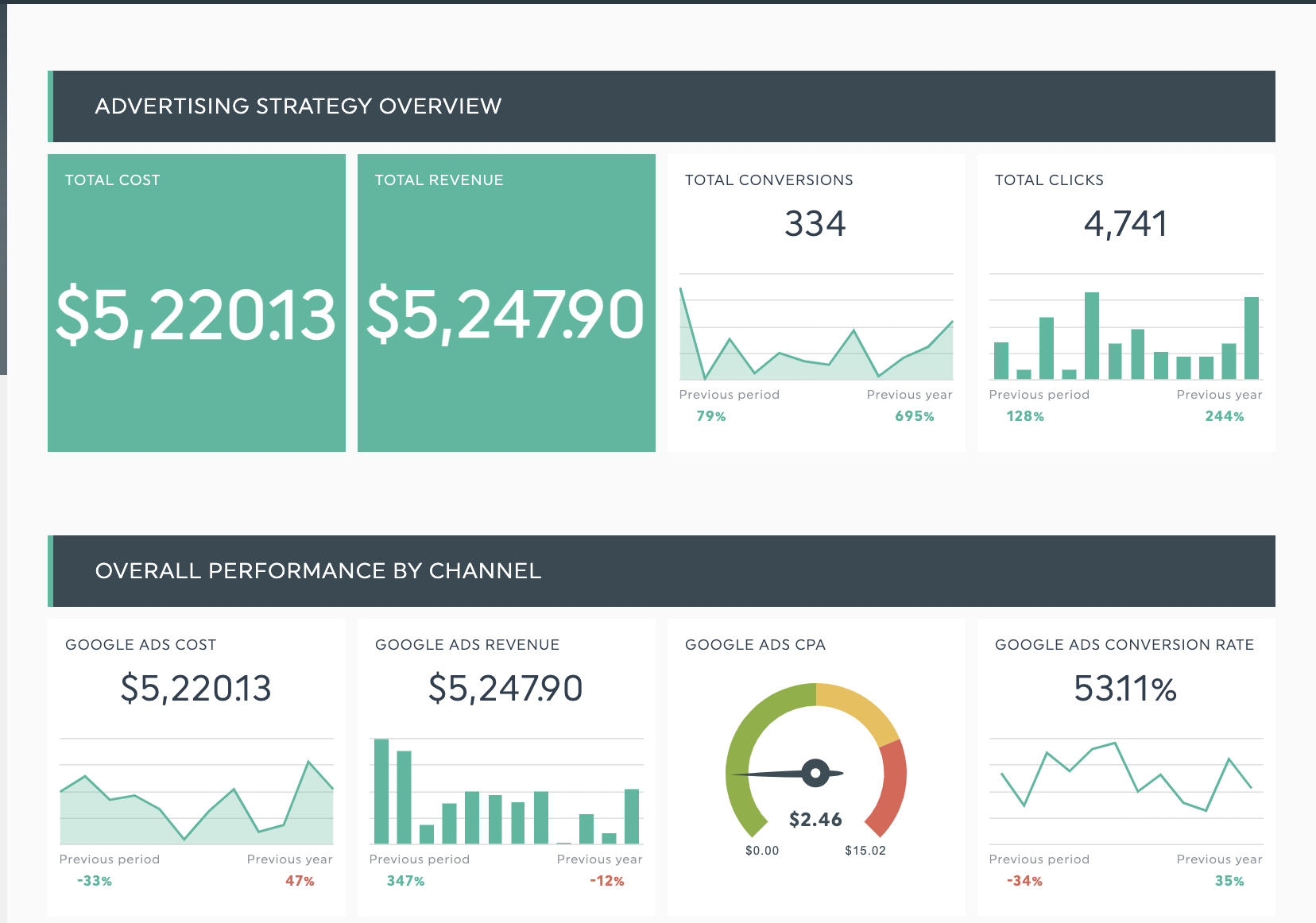
Bar charts
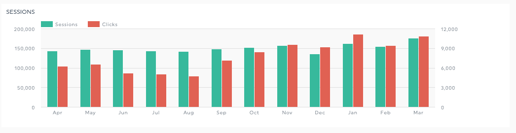
Use a bar chart visualization to compare two KPIs over a similar time scale. This visualization helps you compare and analyze patterns between metrics, such as correlations between sessions and clicks over the past 12 months.
Pie chart
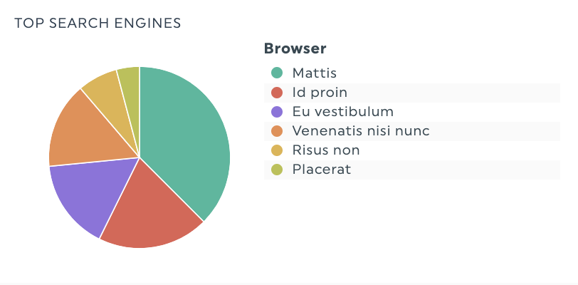
Pie charts can help you visualize metric data that can be divided into different categories as percentages of the whole pie. For example, pie charts can help you visualize audience demographic data, revenue generated by various product categories or a breakdown of web traffic sources.
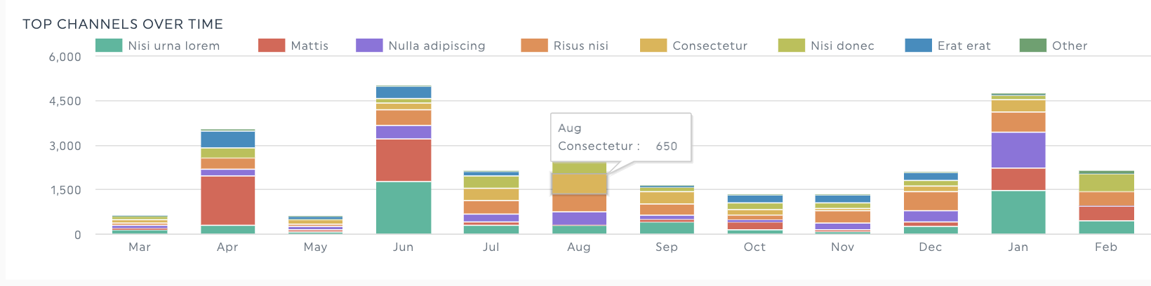
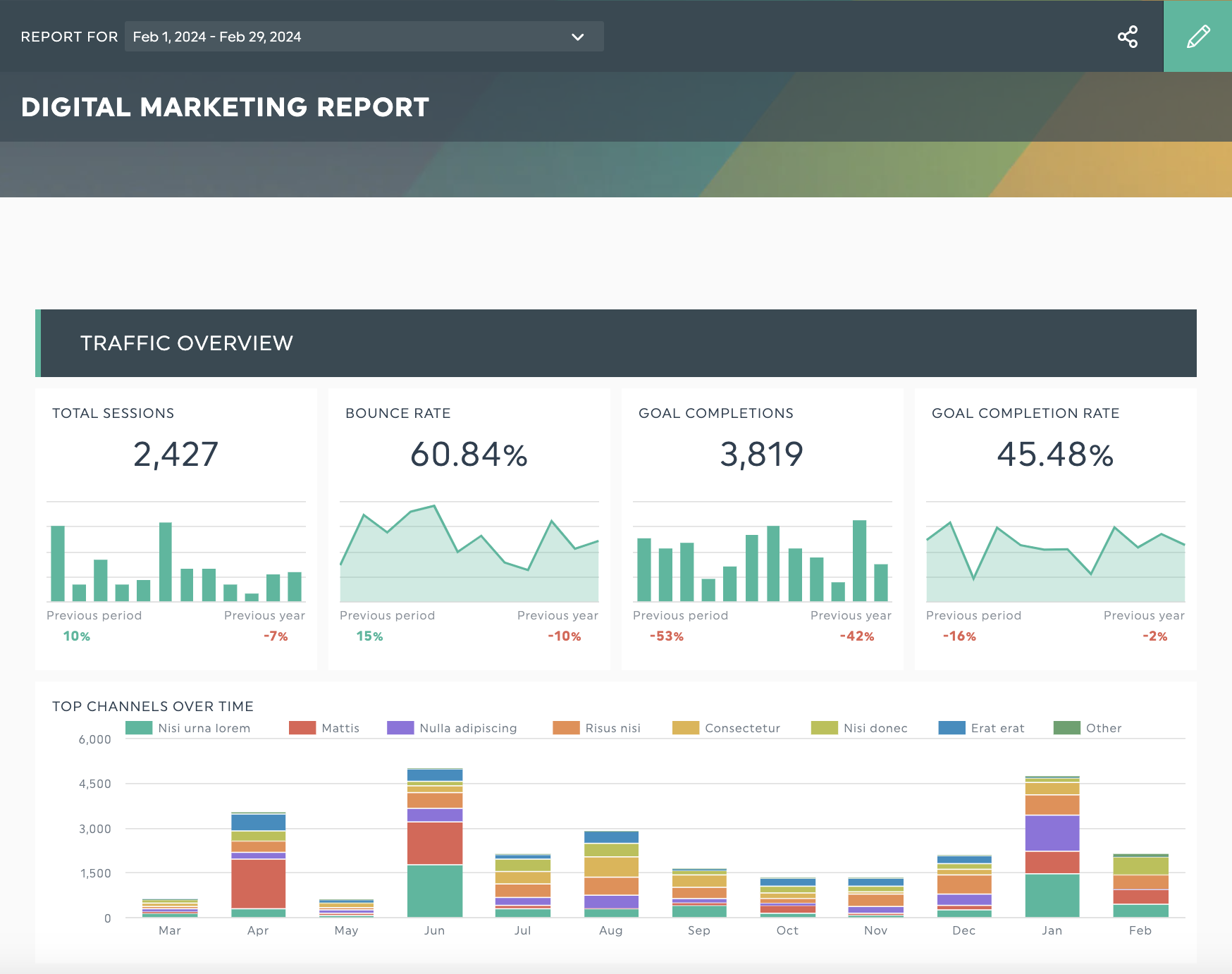
Stacked columns
Use stacked columns to analyze the change in a KPI over time, like showing the impact of an SEO campaign on organic traffic to your client’s website.
Number
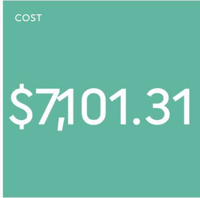
Use this widget to highlight a specific KPI, such as the number of sessions, profits, conversion rate percentages, or leads generated.
Single or multi-column lists
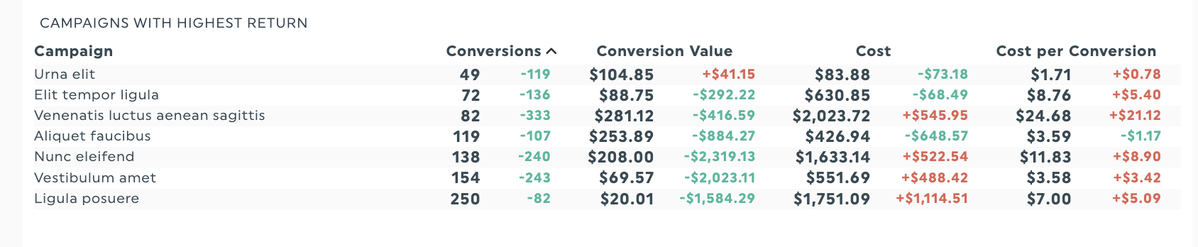
Use a list in one widget to get an overview of campaign performance. For example, this top page widget uses color to show which metrics increased or decreased.
Line graphs
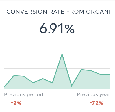
Line graphs excel at showing the progression of a single metric over time or highlighting the impact of a specific campaign on a KPI.
Example metrics to visualize with a line graph:
- Differences in conversion rate before and after a campaign tweak
- Analyze a month's conversion rate against the previous quarter's
- Seasonal variations in average order value
Gauge charts
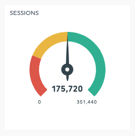
Gauge charts are best for examining your progress towards a goal for essential KPIs. In DashThis, you can configure the values of the colored portions to represent KPI milestones or thresholds. Learn how to do so here.
How to visualize your marketing data with DashThis
Step 1: Define your reporting goals
Start with knowing your report’s aim and what the people reviewing your report want to know.
For example, a local service business owner who wants to know if their marketing is generating revenue and lead pipeline health needs a different report structure to a client aiming to improve their PPC campaign performance.
Get this advertising report template with your own data!
Questions to help you create a suitable design and select the right visualizations
- What is the report's primary goal?
- What data points and goal metrics are your audience interested in?
- What is my audience’s data literacy level?
- Are there any unfamiliar terms I need to define or explain?
- How can I create an intuitive layout?
Step 2: Prepare your data for reporting
Clean, accurate, and consistent data is the key to effective marketing data visualizations. These steps become even more critical when working with multiple team members or departments.
Here, you need to:
- Ensure your tracking and analytics are set up accurately across marketing and analytics tools
- Check you’ve installed conversion tracking and other tracking pixels for PPC campaigns correctly
- Filter out or refine any inaccurate data and irrelevant information
Step 3: Choose a report template based on your campaign goals
We recommend using our digital marketing report template if you’ve got multiple campaigns to track and report on.
Get this digital marketing report with your own data!
This report template includes headers to guide your eye while including appropriate visualizations for the most popular KPIs. Add notes and comments to each metric for context or an executive summary with your main recommendations and findings.
Browse the DashThis report template library for plenty of preset report templates to ensure you never start from a blank page.
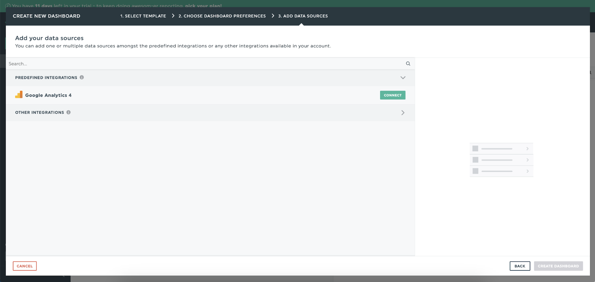
Step 4: Connect your data sources
DashThis has native integrations with multiple digital marketing tools like Google Analytics, Mailchimp and Google Search Console. You can even showcase your paid social ads campaigns on LinkedIn Ads or TikTok ads for complete visibility on your digital marketing campaigns.
Once you’ve connected your digital marketing platforms to DashThis, click on Create Dashboard.
Step 5: Interpret your data
After data visualization, it’s time to interpret the data for your client. This means:
- Putting the data into context for your client’s business
- Spotting opportunities for improvement
- Making a recommendation on how to move forward
For a complete guide on interpreting data with DashThis, check out DashThis’s 5-step guide here.
Tips to make engaging marketing data visualizations
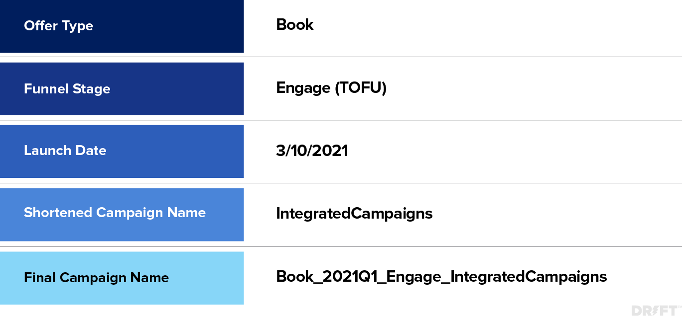
Tip 1: Create a consistent campaign naming structure
Besides creating visualizations and ensuring your data is accurate, it’s also worth creating (and sticking to) a consistent campaign naming structure.
This step becomes even more essential when you collaborate closely with multiple teams or if you work on marketing campaigns with your client’s internal team. While a campaign naming structure doesn’t directly influence marketing results, approaching this step makes day-to-day account management and reporting much easier.
Drift uses a five-part campaign naming system to standardize its campaign names. It then uses these campaign names throughout its internal channels, from Asana tasks to Slack conversations, internal folder names, and UTM parameters. This structured process helps them keep a single source of truth for creating consistent UTM parameters, aiding internal communication and reporting.
Tip 2: Sketch out your data visualizations with pen and paper
Before building reports in your data visualization tool, Francis Angelo Reyes of Lupage Digital draws out his visualizations with pen and paper. Putting pen to paper helps him map out the charts and the story you’re telling without wasting time experimenting and thinking about what charts to use.
Tip 3: Keep your visuals simple and relevant
Visuals are powerful aids when used intentionally. However, too many visuals can also make your report overwhelming and distract from the message you’re trying to convey.
To use visuals intentionally, ensure every visual fits the report’s context. For example, a weekly revenue summary for executives might focus on simple visuals emphasizing high-level data. In comparison, a detailed marketing strategy review might include charts to break down aggregate metrics into distinct categories for further analysis.
Remember to use color to highlight essential elements. Green usually shows an increase or positive changes, whereas red indicates declines or areas of concern in a chart. Stick to a specific color scheme throughout your report to aid understanding.
Tip 4: Keep the most critical data points on top
Keeping the most critical data points at the top ensures that people who don’t have time to review the full report can get the information they need.
Get this executive report with your own data!
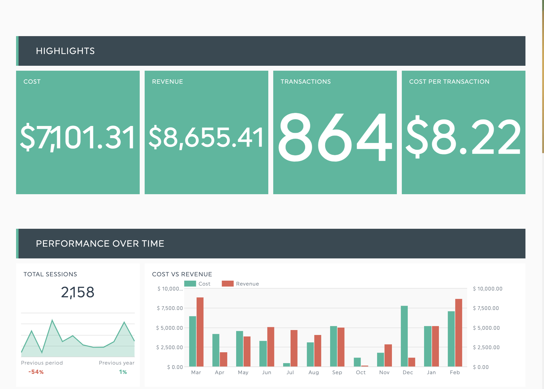
Let’s say you’re creating a revenue report for a busy executive. The DashThis executive report template provides essential cost and revenue information at a glance and details further down.
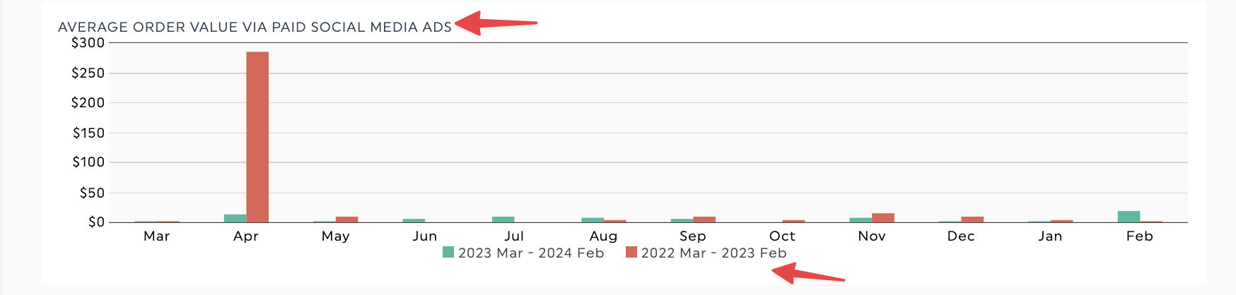
Tip 5: Include context and analysis to explain your report
Ensuring your report is crystal-clear helps your clients reference your reports in their work and interpret the results even in your absence.
Adding helpful context doesn’t need to be complicated, either. Simple elements like labeling the axes of a line graph, titling your charts, or including a legend make your data easier to understand.
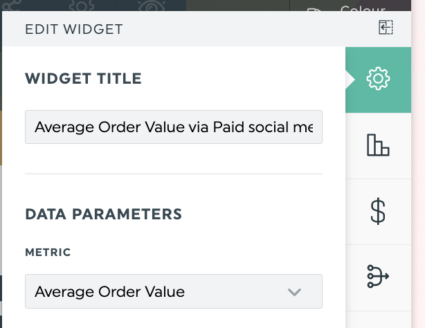
To add or edit a chart title in DashThis, go to Edit Widget > Basic Settings > Widget Title.
You can also add a note to a chart for more context or analysis, such as a definition, recommendation, or explanation. These notes help keep your DashThis report clutter-free while providing the information your client needs.
Level up your marketing reports with DashThis’s data visualization tools
Let’s get real; you have better things to do than manually collecting and formatting data in Excel or Google Sheets weekly for your regular client reporting.
Don’t spend your valuable time wrangling your numbers into a suitable report. Use report automation to save time on manual reporting and create more effective and engaging reports.

See how you can visualize your data with Dashthis!
Read More

Don’t miss out!
Follow us on social media to stay tuned!
Automate your reports!
Bring all your marketing data into one automated report.
Try dashthis for free